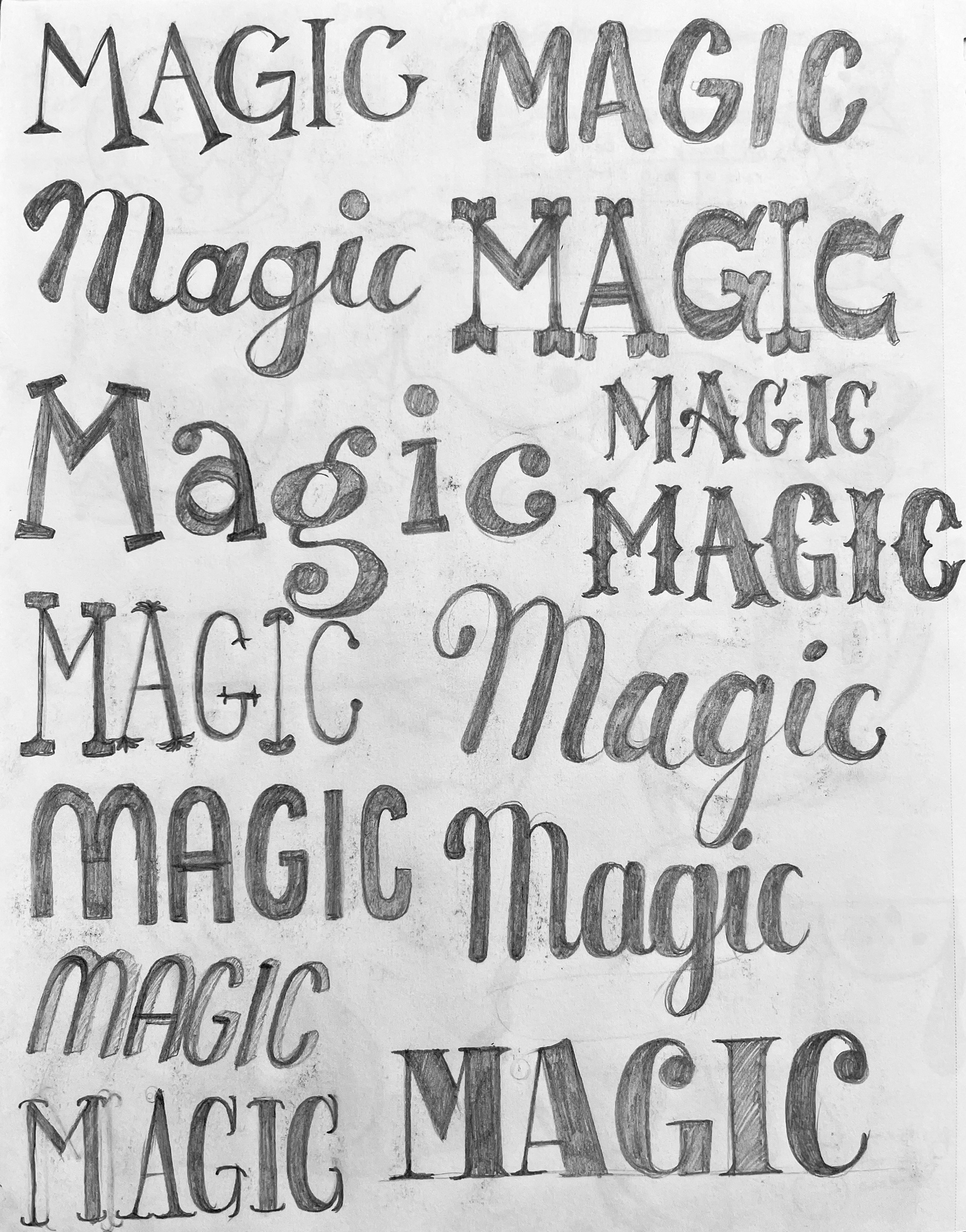
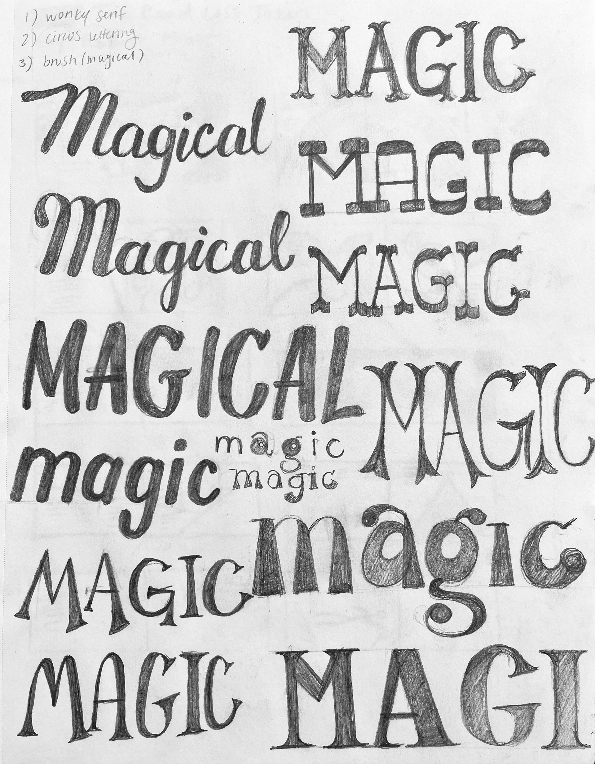
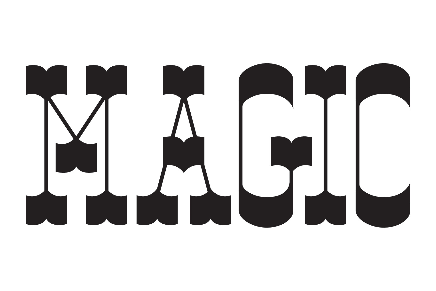
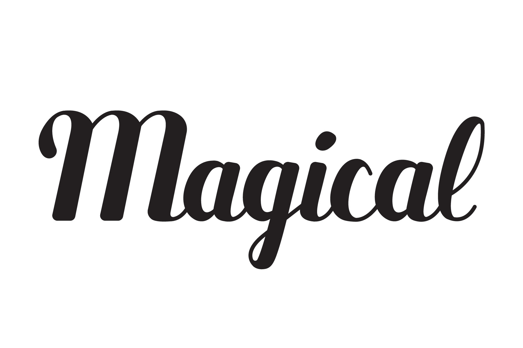
I lettered the word "magic" exploring the word's different personalities and designing a postcard.
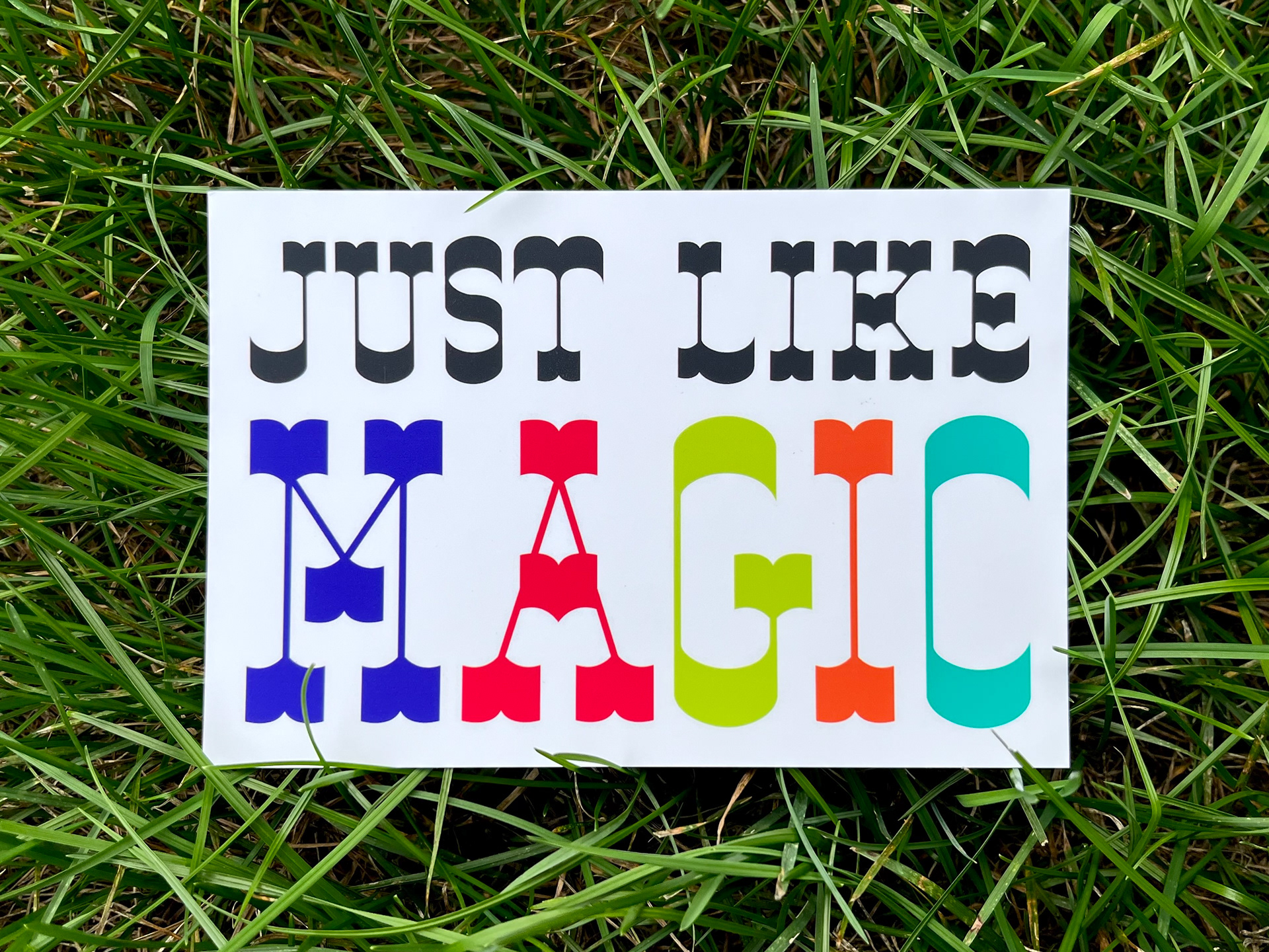
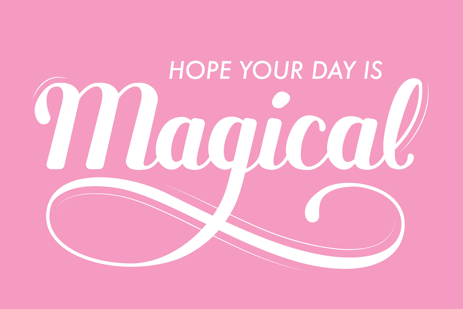
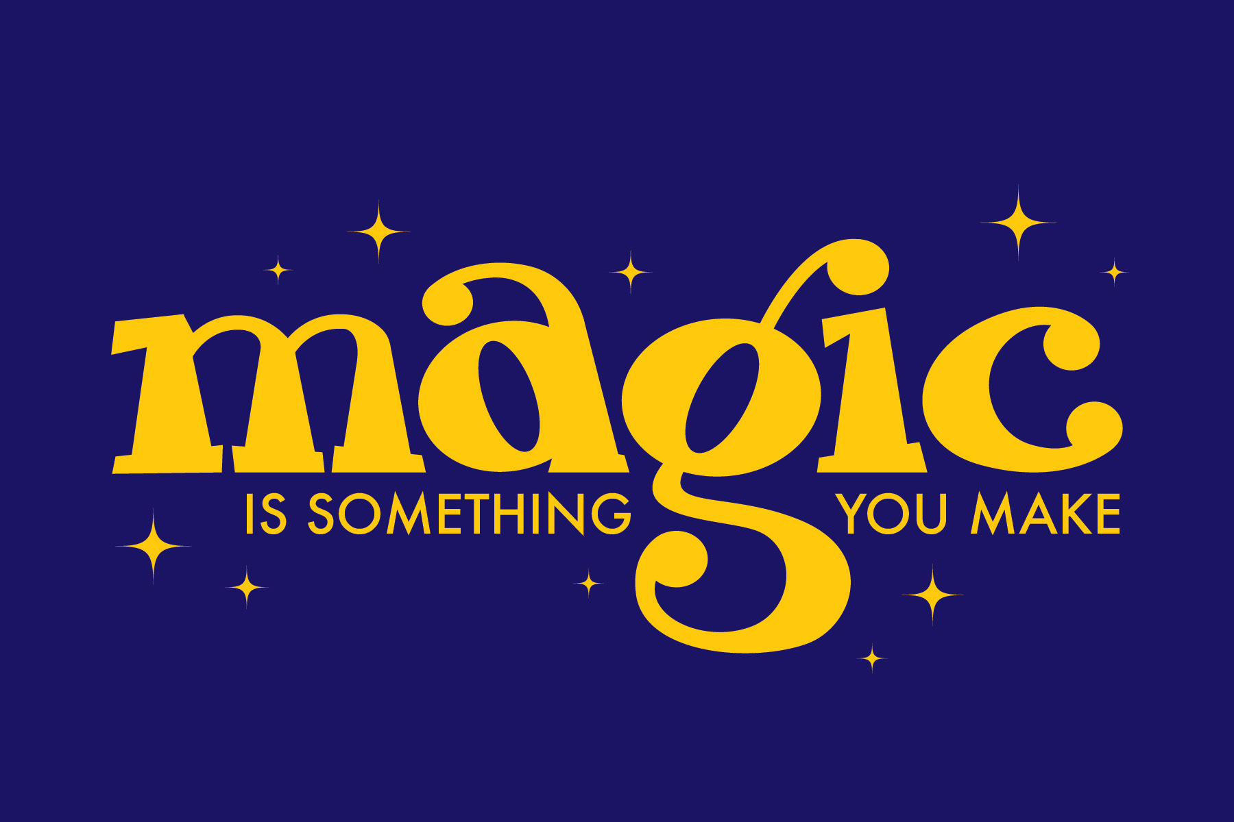
I vectorized my final sketches in Illustrator to refine them further and see how they looked with color. I decided to use these lettering styles because they show a variety of magic personalities.
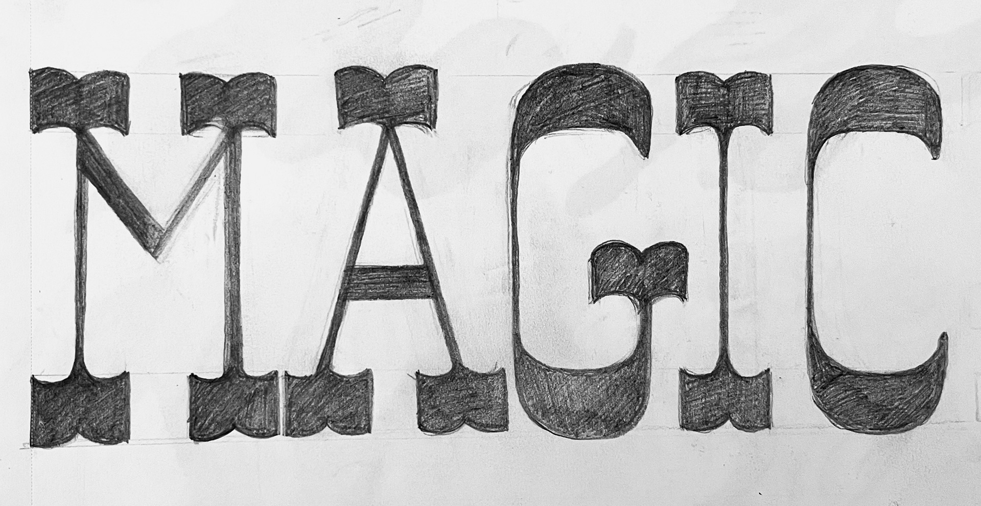
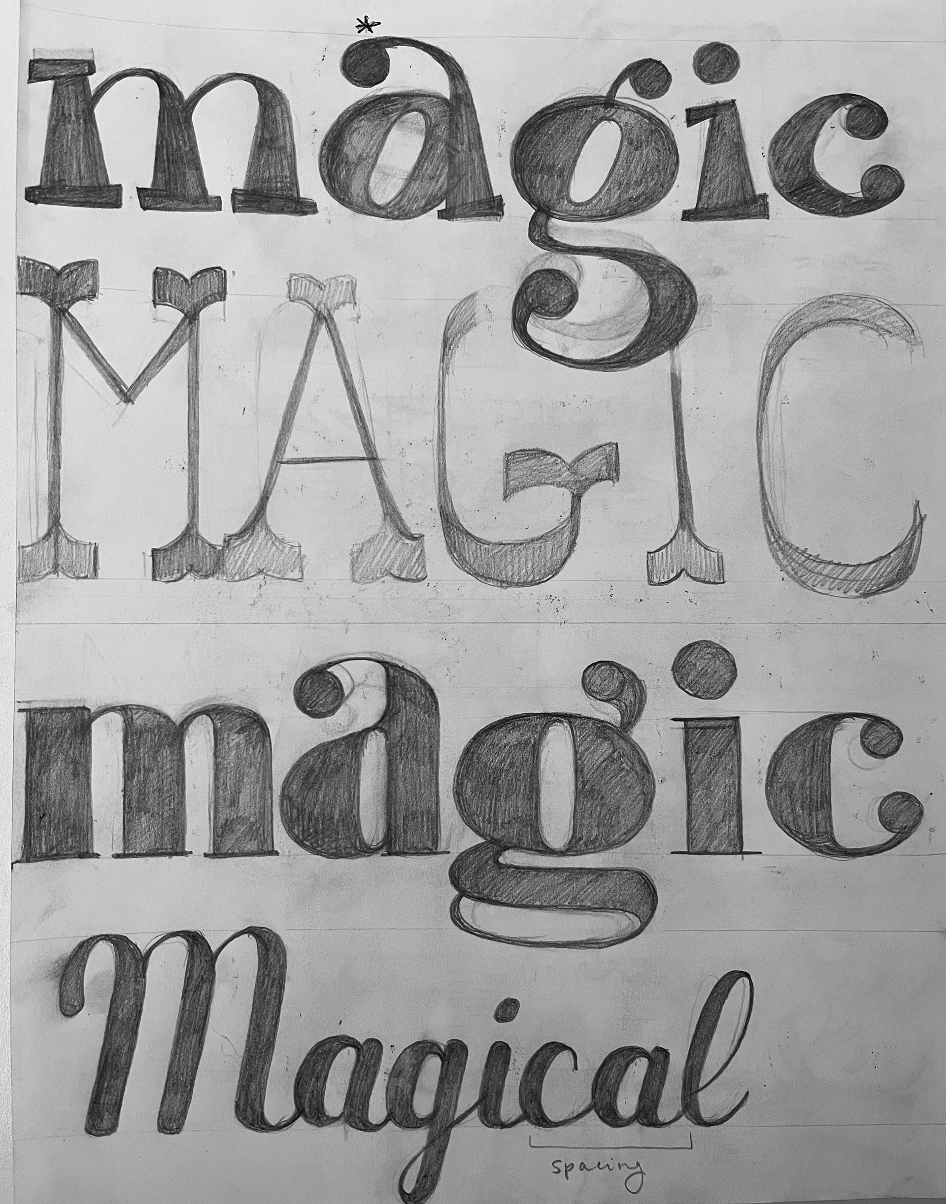
The first below shows a playful personality with its crooked serifs, chunky weight, and diagonal stress. I received feedback to add a ligature connecting the 'i' and the 'g,' which I added (above) to increase the playful personality. The second below shows an odd and mischievous personality with its thick bifurcated serifs reminiscent of old circus posters. The third "magical" word below shows the romantic and whimsical feeling of magic with a more gentle brush stroke style.
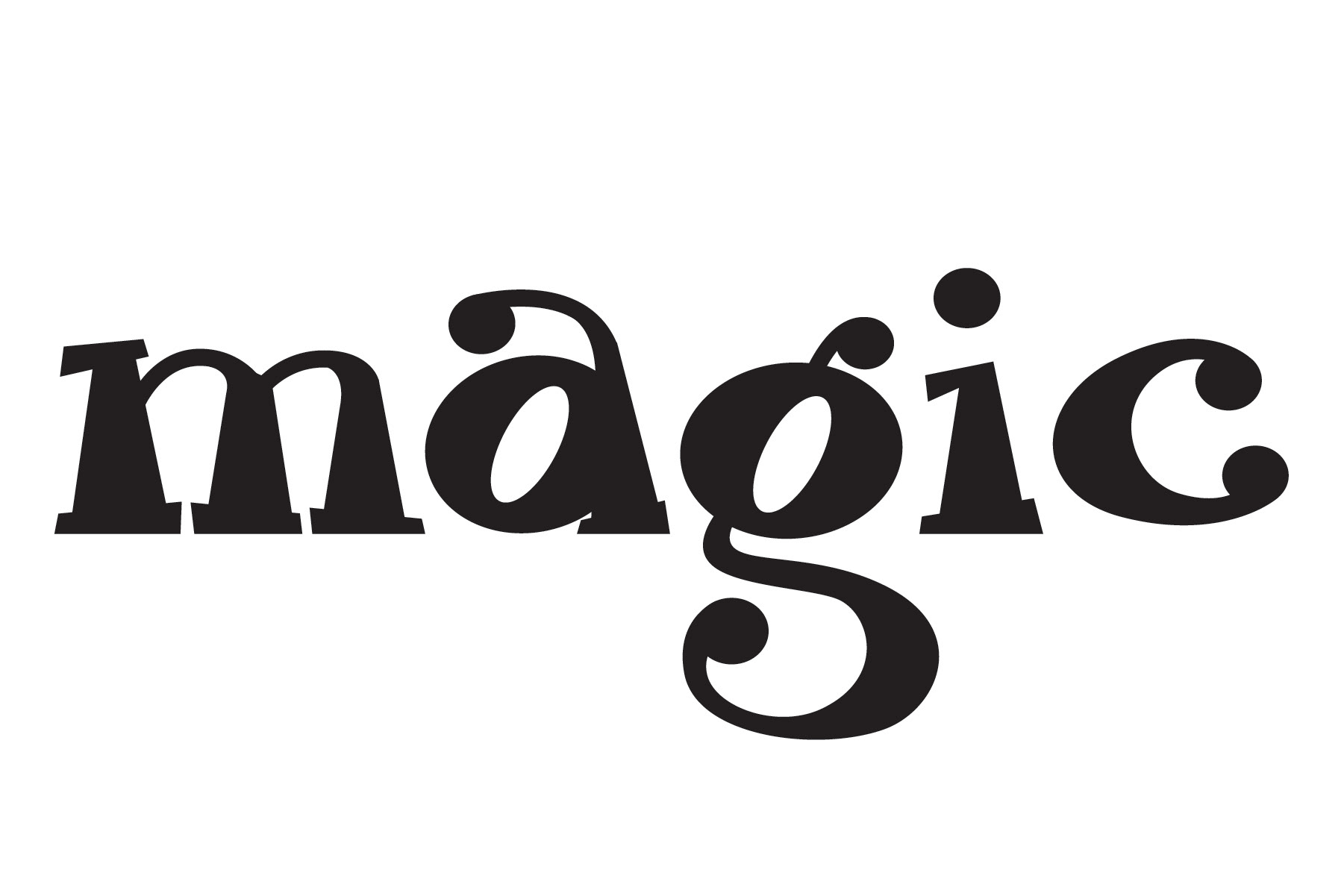
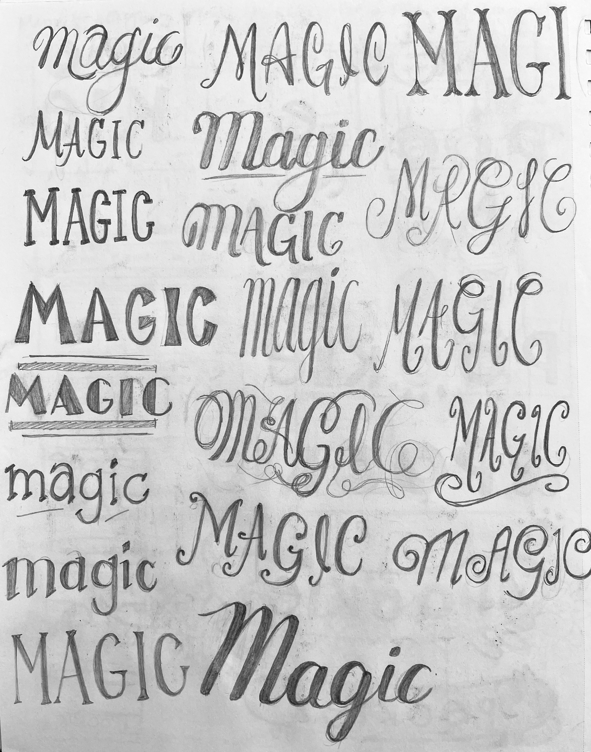
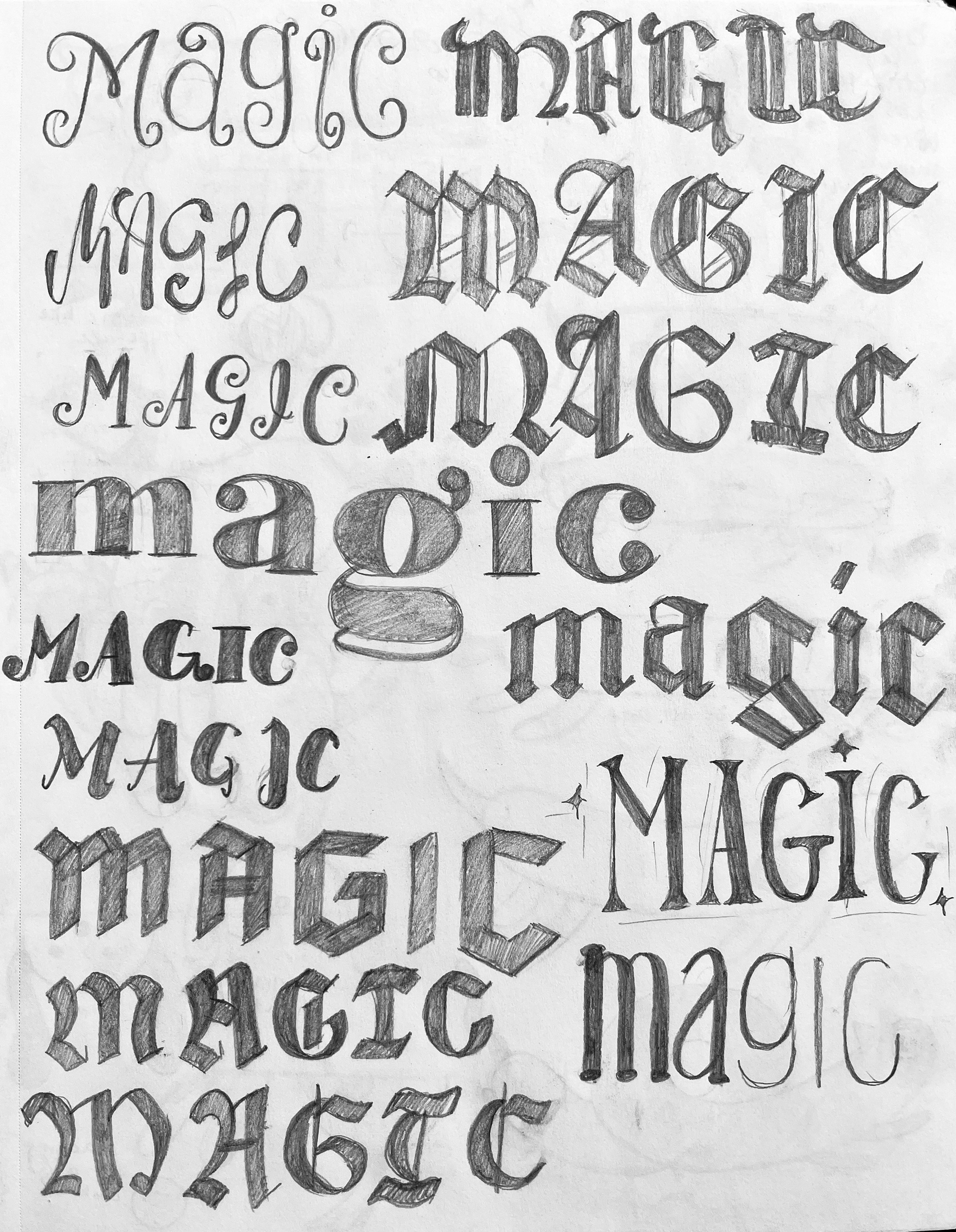
I always start my process with paper and pencil sketches. I created sketches with various lettering styles to experiment giving different personalities to the word. I experimented with scripts and flourishes for a whimsical feeling, black letter for a darker magic, serifs and high contrast for a lively energy, and more. Then I refined my best thumbnails at a larger scale.
